


Annual Appreciation Event
Since 2023, I have collaborated with Keep Indianapolis Beautiful on their Annual Appreciation Event, utilizing compelling marketing initiatives and exciting promotional invitations. Each campaign is a testament to my ability to capture the essence of KIB’s brand, delivering impactful visuals and persuasive messaging across digital and physical mediums.
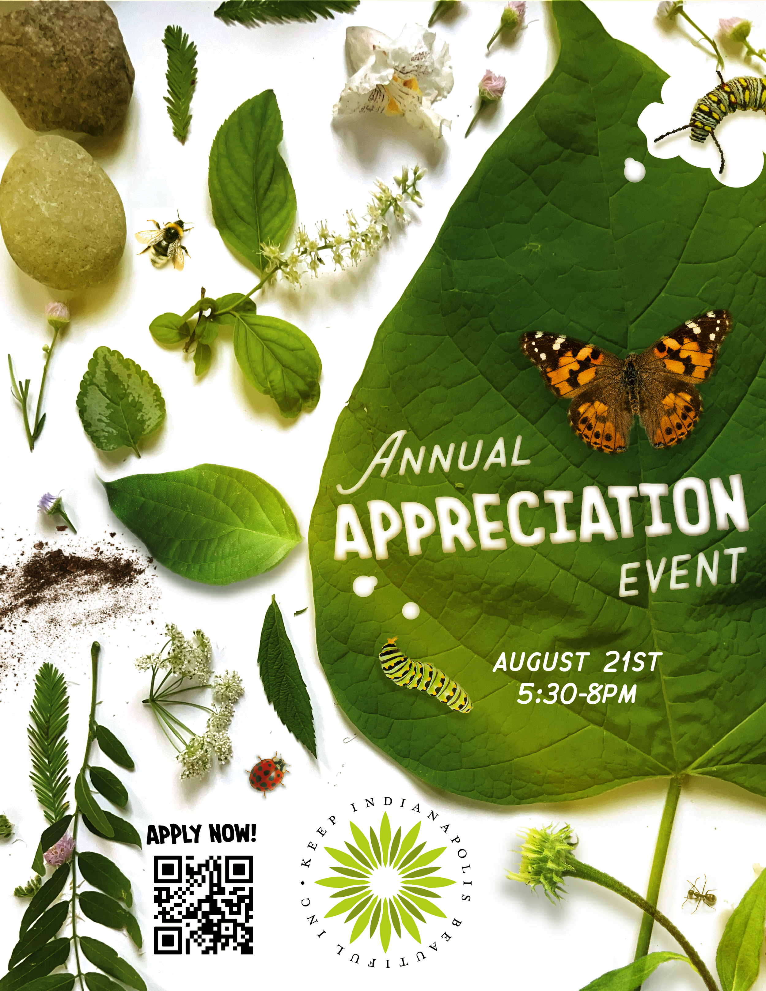
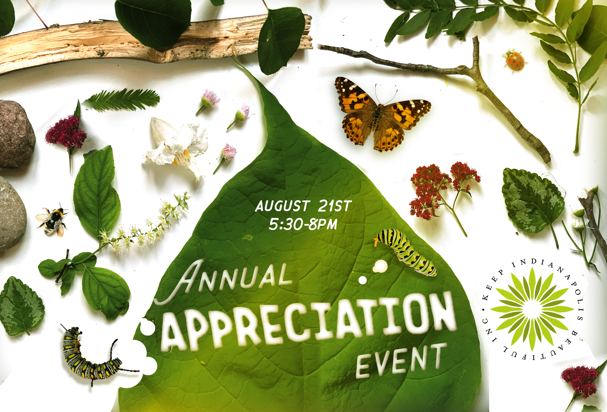
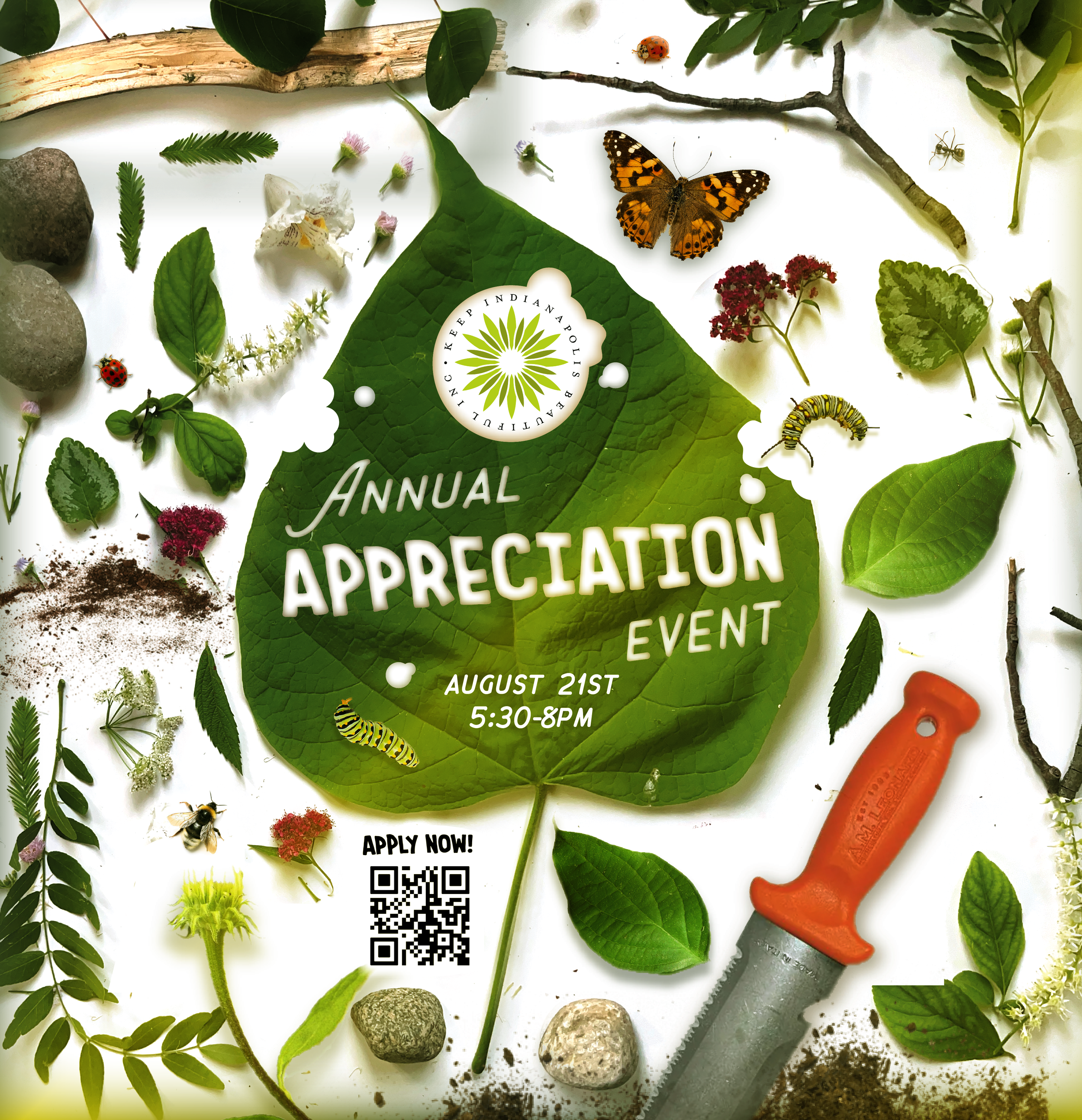
This flyer features a nature-inspired, photographic flat-lay design that blends realism with playful discovery. I actually foraged my neighborhood in search of local plants for this piece. Set against a crisp white background, an arrangement of some real/some photoshopped leaves, stones, soil, flowers, and insects creates a richly detailed composition that feels tactile and immersive. The organic elements are carefully placed to guide the eye across the layout, with a large green leaf anchoring the right side and serving as a natural canvas for the event title.
The typography is clean and approachable, blocked out seamlessly into the leaf to signify evidence of caterpillar munches. Soft shadows and dimensional lighting enhance the realism, giving the piece depth while maintaining a fresh, modern feel. Pops of color from the butterfly, caterpillar, ladybug, and bee add visual contrast against the dominant greens, reinforcing themes of growth, biodiversity, and community connection.
The design was inspired by Walter Wick’s I Spy books, embracing his sense of curiosity, close observation, and carefully curated visual storytelling. Like Wick’s work, the composition invites viewers to linger and explore—discovering small details tucked throughout the layout. This interactive, discovery-based approach transforms the flyer from a simple announcement into an engaging visual experience that celebrates nature, attention to detail, and playful exploration.
2025
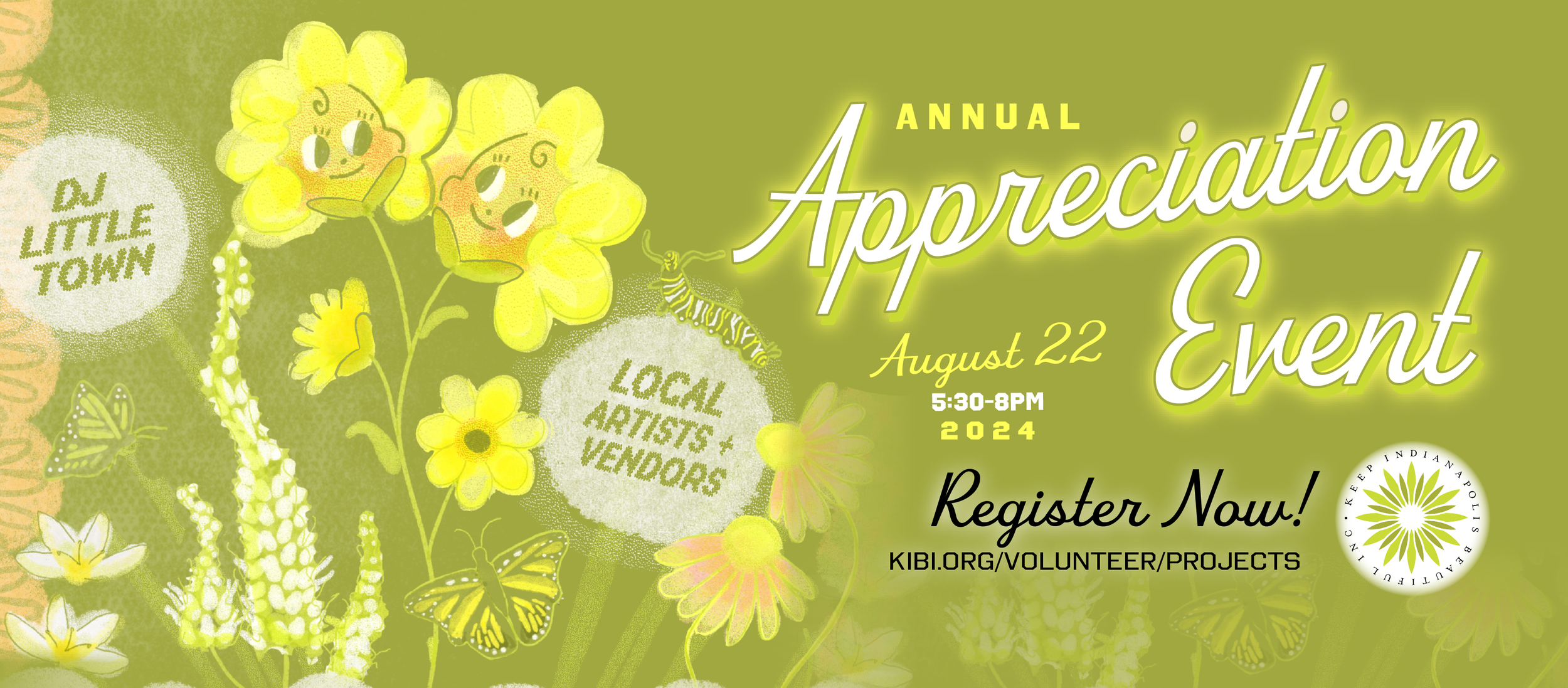
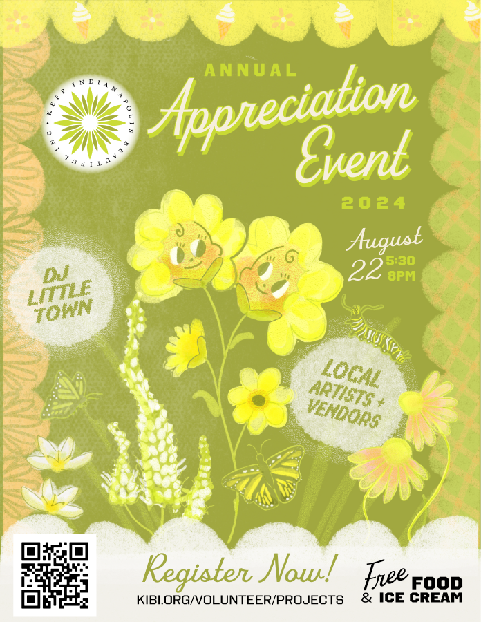
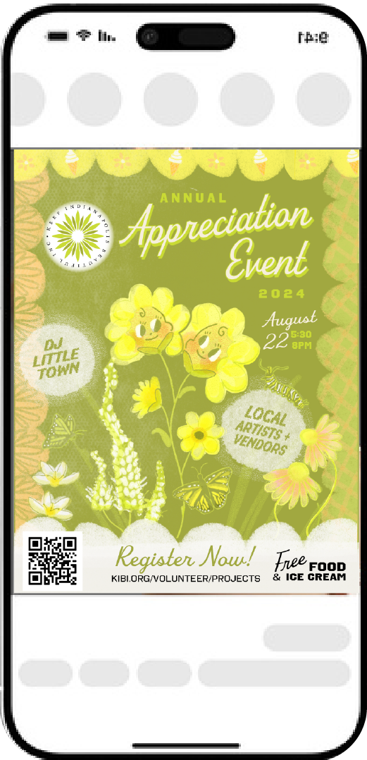
2024
This flyer features a warm, retro-inspired botanical design with a playful, community-focused feel. The overall color palette is dominated by soft chartreuse and olive greens, layered with textured gradients and subtle grain effects that give the piece a screen-printed, vintage poster aesthetic
At the center, I used Procreate to illustrate whimsical flowers with friendly, smiling faces create a welcoming and lighthearted tone. The hand-drawn style is expressive and slightly nostalgic, blending mid-century illustration influences with modern digital softness. Monarch butterflies/caterpillars and layered florals add movement and depth, reinforcing themes of growth, nature, and local connection.
Overall, the design combines nostalgic charm, vibrant botanical illustration, and modern layout structure to create a lively, inviting promotional piece that feels both artistic and community-centered.
![annualappreciation event]-DESKTOP-GOKD4P2-01.png](https://images.squarespace-cdn.com/content/v1/698cc9dfbdb52d7ed1879f61/81e01ed7-5538-4021-99ed-a72da5077b1e/annualappreciation+event%5D-DESKTOP-GOKD4P2-01.png)
2023
Throughout the composition, I illustrated every native Indiana plant and animal featured in the piece, from flowering species and trees to birds, insects, and mammals. Each element was thoughtfully drawn to celebrate local biodiversity while maintaining a cohesive, stylized visual language. The silhouettes and simplified forms lend the artwork a timeless quality, while pops of green highlight growth and vitality.
The overall result is a graphic, heritage-inspired celebration of Indiana’s natural landscape—combining conservation storytelling, handcrafted illustration, and bold typographic structure into a visually memorable event poster.